Order and Form
Category
Branding, Content Production
Project Type
Concept Project
Project
Fish & Love
Services
Creative Direction
Art Direction
Visual Identity
Graphic Design
Year
2026
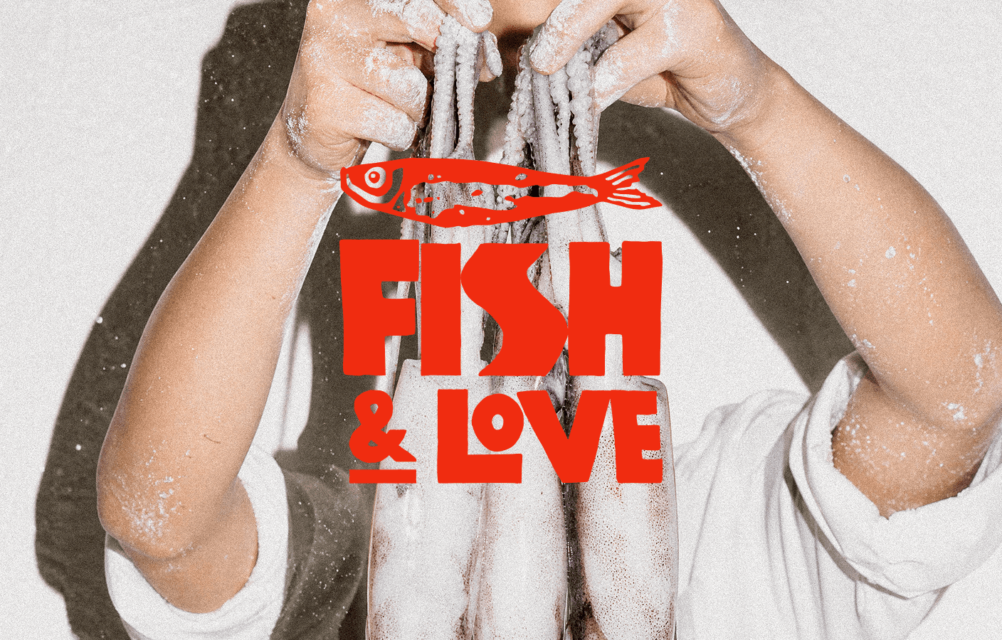
Fish & Love is a conceptual branding project for a Spanish-style fast food friduría designed for a new generation of seafood lovers looking for honest food and strong visual character. Built around the culture of fried seafood as an everyday ritual, the brand positions itself at the intersection of street food authenticity and contemporary editorial design.
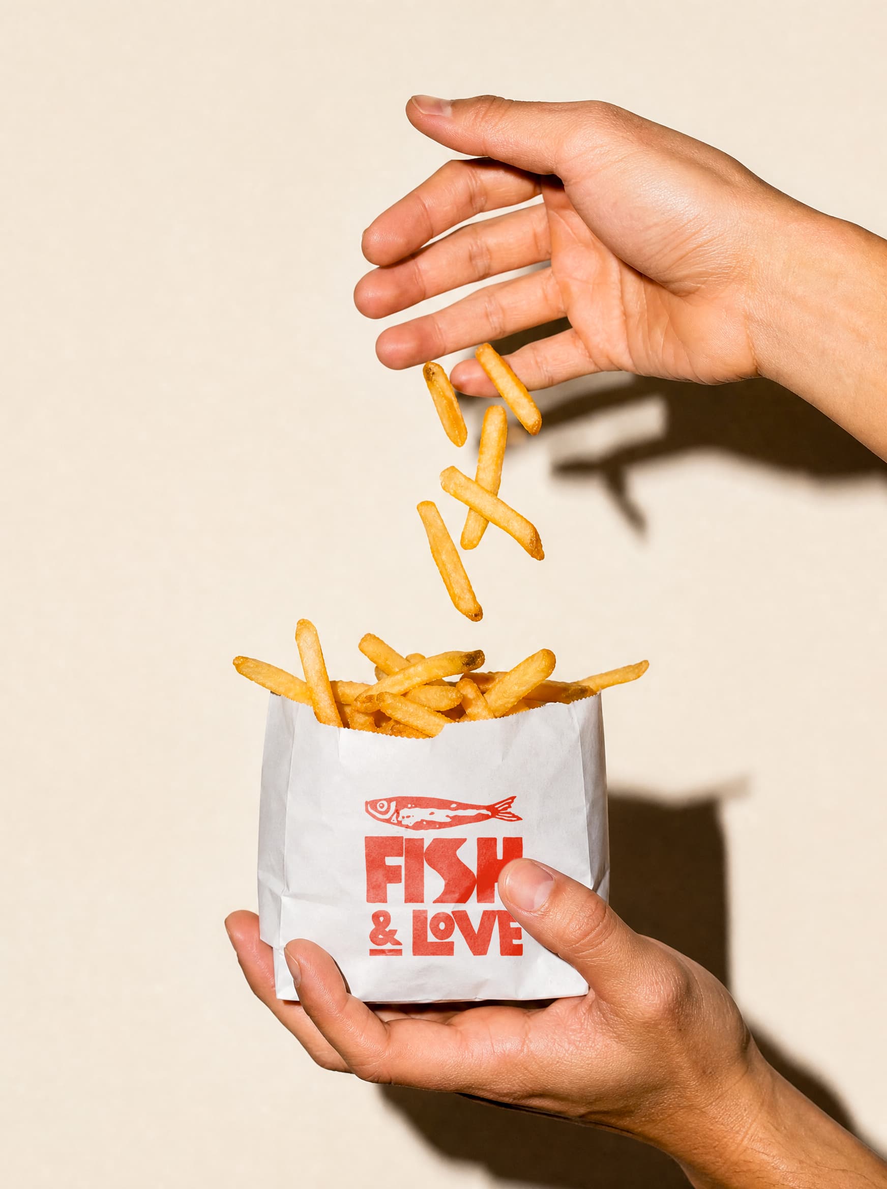
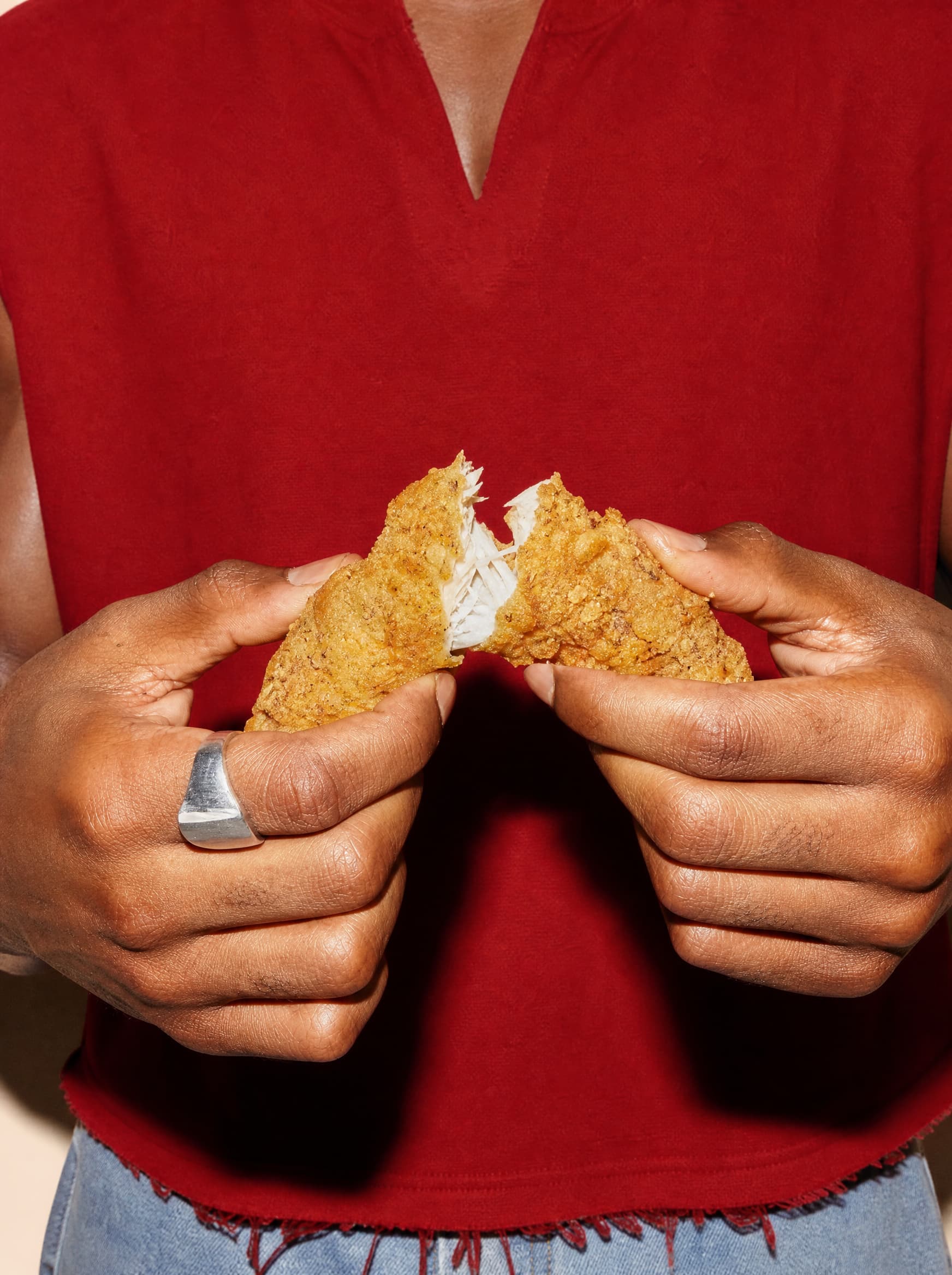
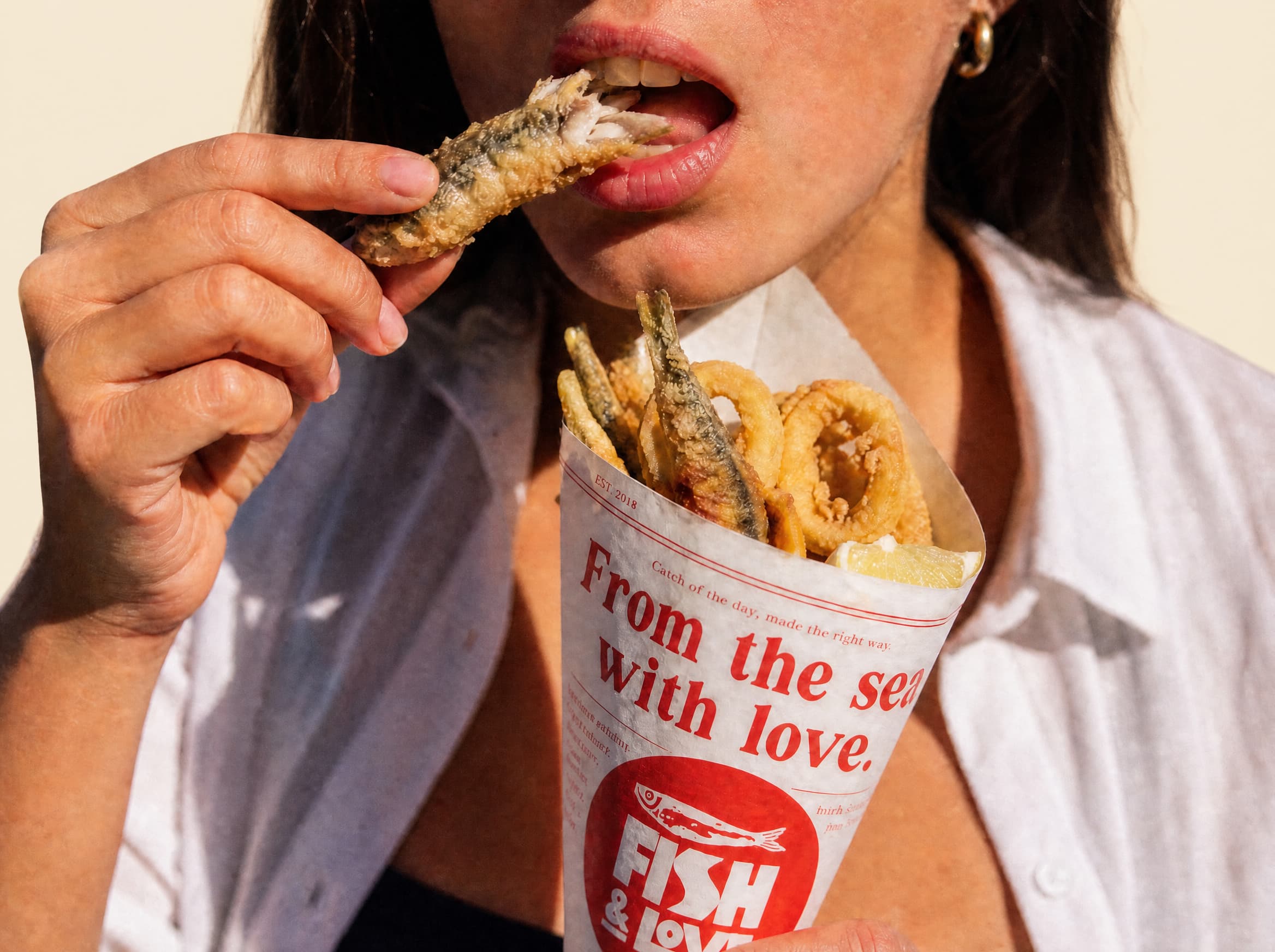
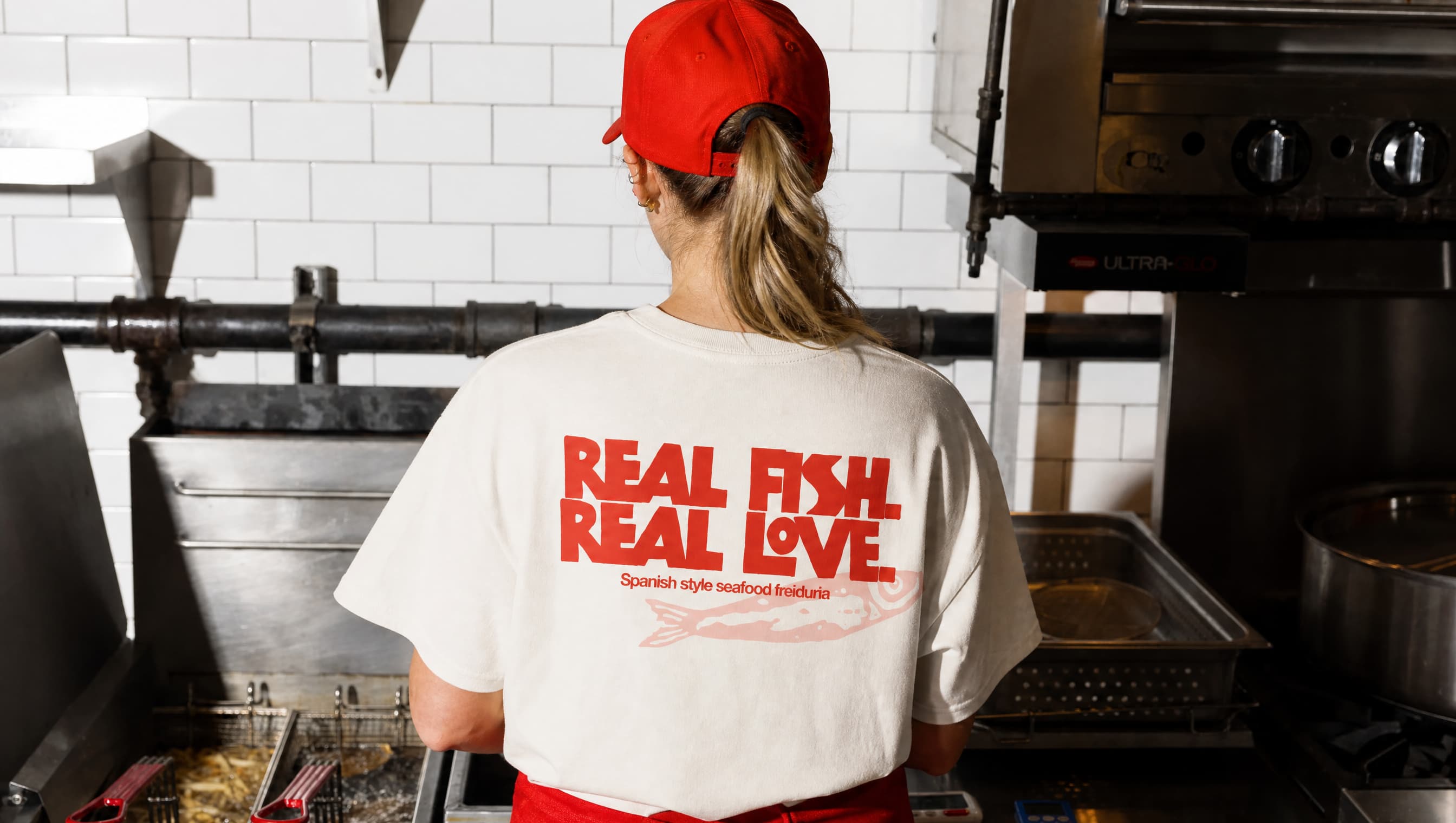
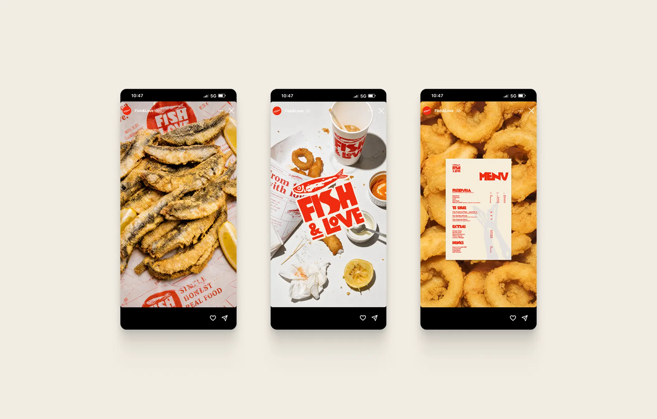
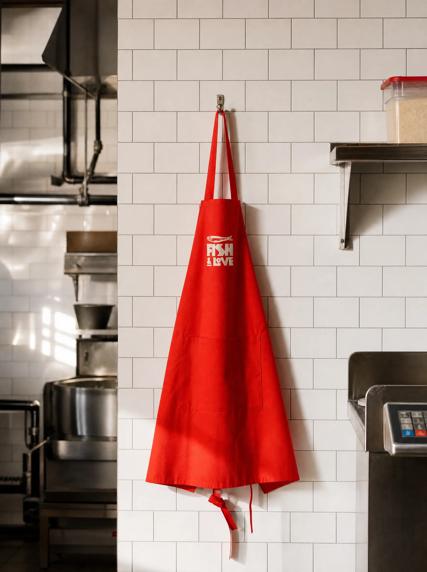
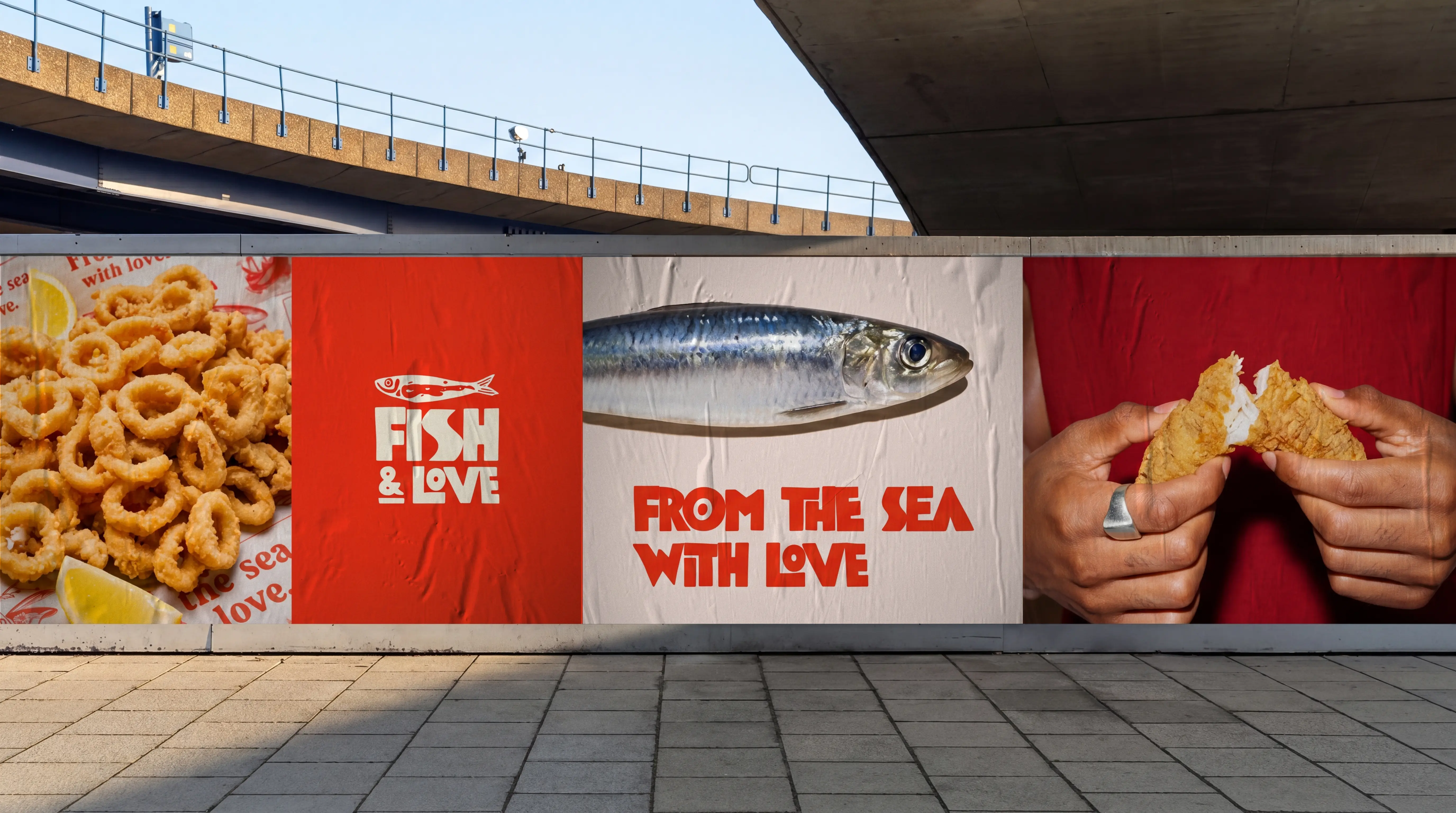
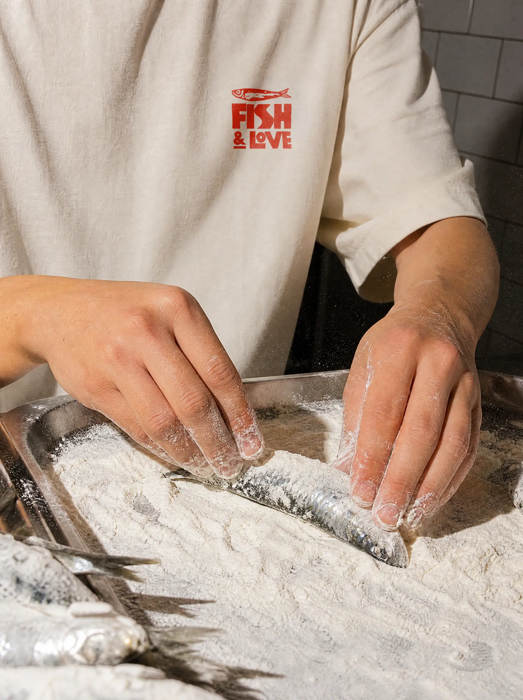
Unlike traditional fast food branding that relies on corporate color systems and predictable visual codes, Fish & Love explores a strict two-color duotone system, red and cream, paired with a hard flash photography aesthetic that gives the brand an editorial quality rarely found in the category. Every decision, from the sardine pattern on the packaging to the chunky woodcut typography, reinforces a single idea: real fish, made with love.
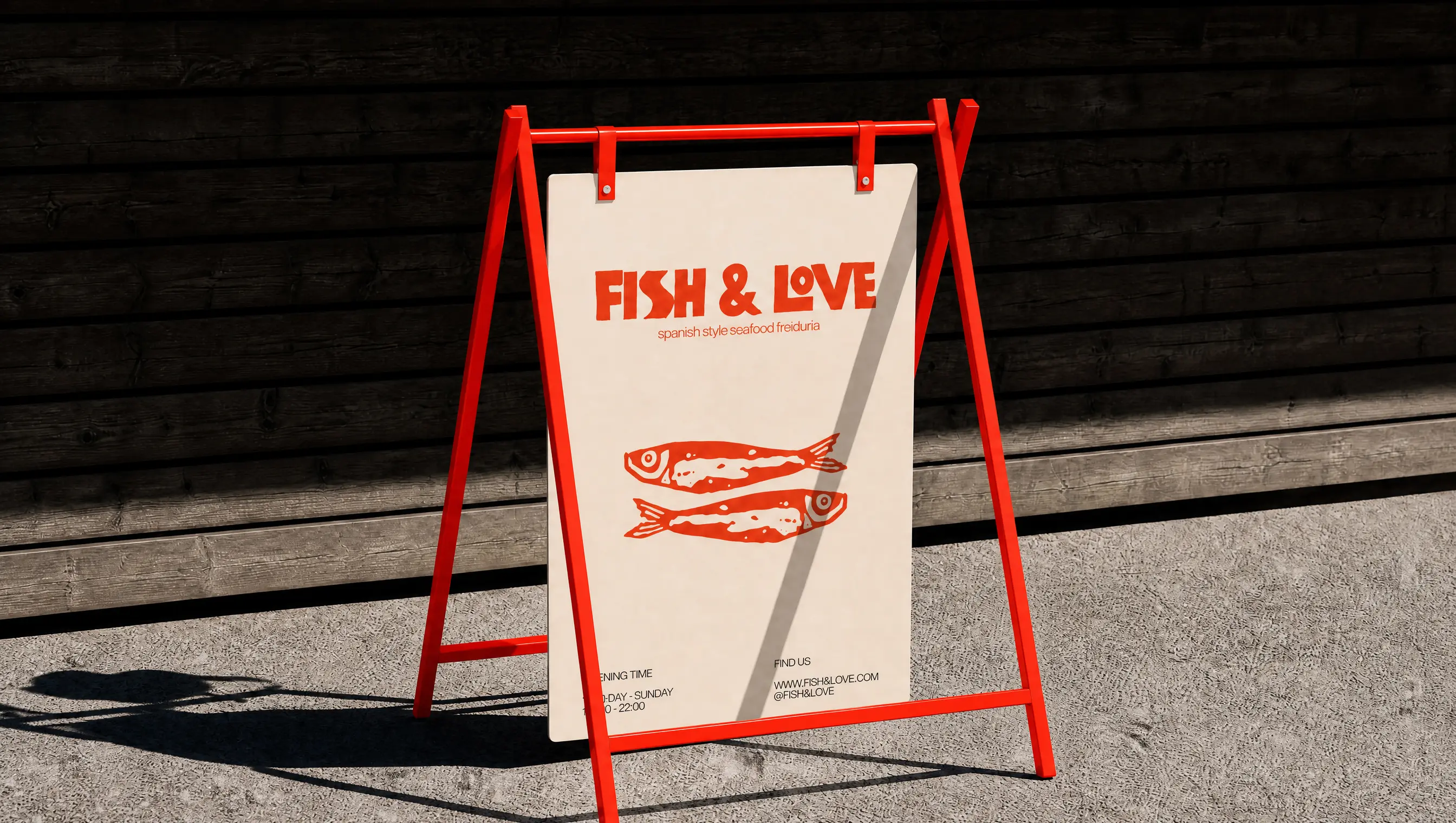
The project investigates how a fast food brand can carry genuine creative direction without losing its working-class roots. From packaging and signage to murals, merch and digital presence, the visual system was developed and produced end to end, demonstrating that creative ambition and production speed are not in conflict.
Order and Form
Category
Branding, Content Production
Project Type
Concept Project
Project
Fish & Love
Services
Creative Direction
Art Direction
Visual Identity
Graphic Design
Year
2026
Fish & Love is a conceptual branding project for a Spanish-style fast food friduría designed for a new generation of seafood lovers looking for honest food and strong visual character. Built around the culture of fried seafood as an everyday ritual, the brand positions itself at the intersection of street food authenticity and contemporary editorial design.
Unlike traditional fast food branding that relies on corporate color systems and predictable visual codes, Fish & Love explores a strict two-color duotone system, red and cream, paired with a hard flash photography aesthetic that gives the brand an editorial quality rarely found in the category. Every decision, from the sardine pattern on the packaging to the chunky woodcut typography, reinforces a single idea: real fish, made with love.
The project investigates how a fast food brand can carry genuine creative direction without losing its working-class roots. From packaging and signage to murals, merch and digital presence, the visual system was developed and produced end to end, demonstrating that creative ambition and production speed are not in conflict.